The purpose of this article is to show some popular header designs and how to achieve them.
Example 1

This example demonstrates how to use the off canvas panel only without other menu items. It is use in Landing template in our site library.
The first step to create this header is to activate the off canvas panel for either desktop only or both desktop and mobile.
Then create a new menu without any items in it and assign this menu to the Primary Menu under Display locations.
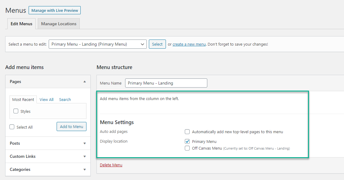
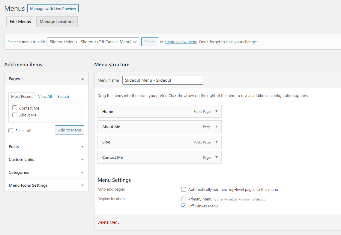
Next, create a new menu again but this time add in the desired menu items and assign this menu to the Off Canvas Menu under Display locations.
Lastly, you can choose where the toggle appears by using the navigation location option in the customizer.
Example 2
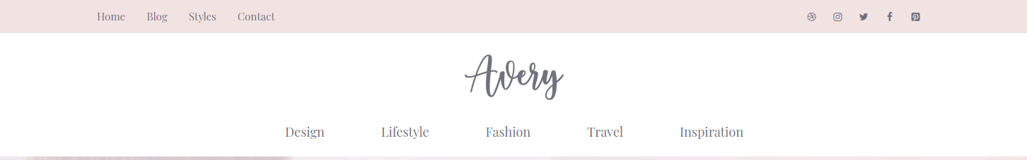
This header design is used in Avery template in our site library.
The first step to create this header is to create two new menus.
Assign the menu you want to appear below the logo (Design, Lifestyle, Fashion Travel and Inspiration in the screenshot) to the Primary Menu under Display locations and set the navigation location to below header.
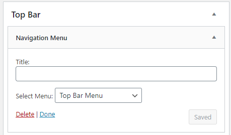
Then add the other menu (Home, Blog, Style, Contact in the screenshot) using the Navigation Menu widget in the Top Bar widget area.
Lastly, add Lightweight Social Icons as the second widget in the Top Bar widget area.
If you’d like more appearance controls of the menu in the top bar area, you can also assign the menu to the Secondary Menu under Display locations and set the navigation location to above header then activate the Merge with Secondary Navigation option in the top bar layout.
Now you can change the color of the menu in Customizer > Colors > Secondary navigation and the font of the menu in Customizer > Typography > Secondary navigation.
Example 3

This example demonstrate how to split the navigation in half with the logo in middle and is used in the Split template in our site library.
It’s a little more complicated and the detailed steps are explained in this article.
Example 4
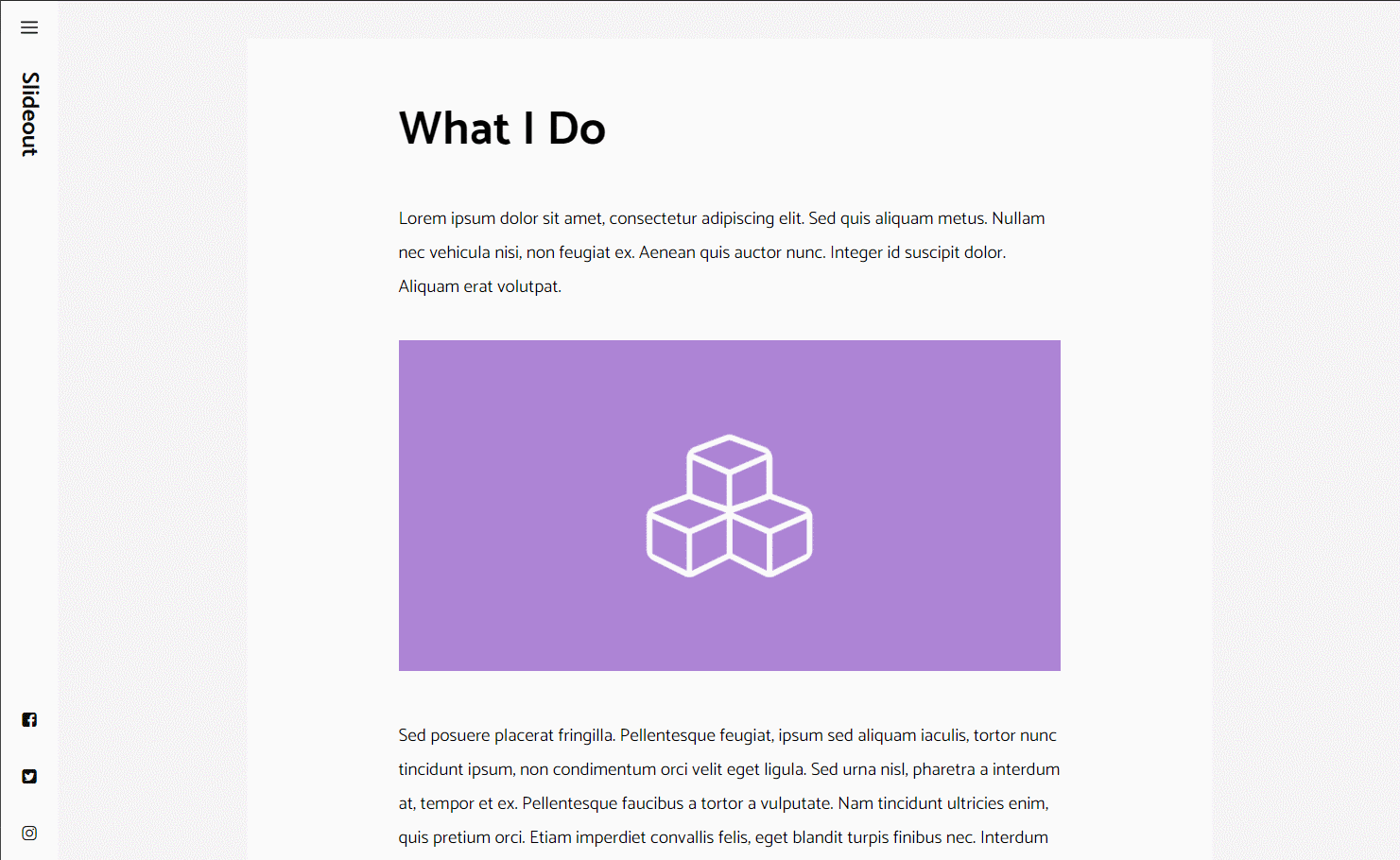
This example positions the header to the left of the page and incorporate the off canvas panel.
It is used in the Slideout template in our site library.
The first step to create this header is to activate the off canvas panel for either desktop only or both desktop and mobile.
Next, create a new menu with desired menu items and assign this menu to the Off Canvas Menu under Display locations.
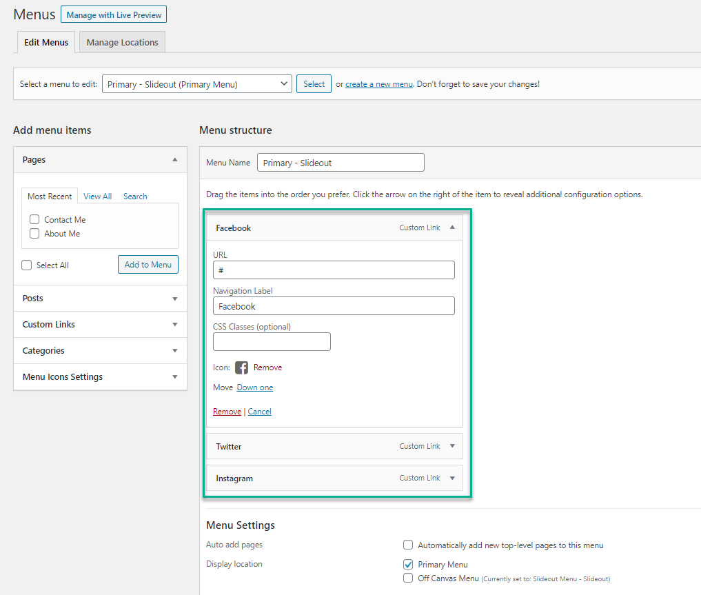
Next, install and activate the Menu Icons plugin, then create a new menu with the desired icons and assign this menu to the Primary Menu under Display locations.
You can also add other content inside the off canvas panel using the widget area.
The last step is to add the required custom CSS:
/* Side menu CSS */

@media (min-width: 769px) {
    body {
	padding-left: 60px;
    }
}

#site-navigation {
    position: fixed;
    left: 0;
    min-height: 100vh;
    max-width: 60px;
    overflow: hidden;
}

#site-navigation .inside-navigation {
    flex-direction: column;
    flex-wrap: nowrap;
    min-height: 100vh;
}

.admin-bar #site-navigation .inside-navigation {
    min-height: calc(100vh - 32px);
}

#site-navigation .navigation-branding {
    transform: rotate(90deg);
    display: block;
    height: 100%;
    margin: 30px 0 auto;
}

#content {
    padding: 40px;
}

#main,
.sidebar > .inside-right-sidebar,
.sidebar > .inside-left-sidebar{
    margin-top: 0;
    margin-bottom: 0;
}

#site-navigation .main-nav > ul {
    flex-direction: column;
}

.menu-bar-items {
    order: -10;
}
#site-navigation .rotate {
    transform: rotate(90deg);
    margin-bottom: auto;
    white-space: nowrap;
}

@media (max-width: 768px) {
    #site-navigation .menu-toggle {
	display: none;
    }
}
.site-footer {
    padding: 0 40px;
}
Example 5
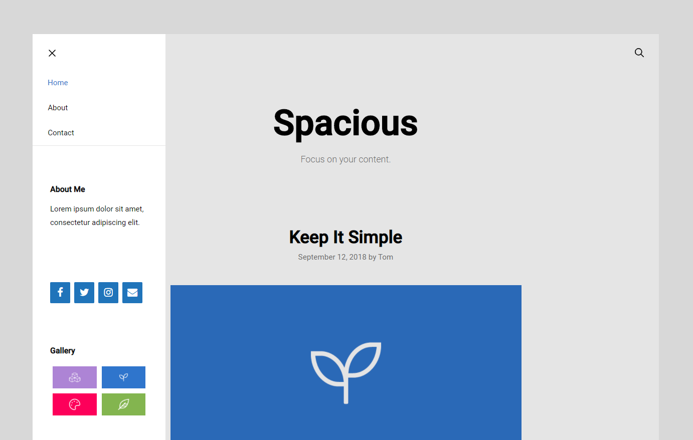
This is another example which incorporates the off canvas panel with some custom CSS style and can be seen in Spacious template in the site library.
The first step to create this header is to activate the off canvas panel for either desktop only or both desktop and mobile.
Then create a new menu without any items in it and assign this menu to the Primary Menu under Display locations.
Next, create a new menu again but this time add in the desired menu items and assign this menu to the Off Canvas Menu under Display locations.
Then activate the navigation search option in the customizer (optional).
You can also add other content inside the off canvas panel using the widget area.The Spacious template is using a text widget for the About Me section, follow by a Lightweight Social Icons widget, then a Gallery widget:

The last step is to add the CSS below:
/* Slideout navigation */

.slideout-navigation button.slideout-exit {
    font-size: 18px;
    margin-top: 5px;
}

.slide-opened .main-navigation.offside {
    transform: initial;
    position: absolute;
    top: 0;
    left: 0;
    height: 100%;
    z-index: 100 !important;
}

.slideout-overlay {
    background-color: rgba(0,0,0,0.1);
    z-index: 99;
}

#generate-slideout-menu .close-slideout.sfHover a {
    color: inherit;
}

.slideout-navigation .main-nav {
    border-bottom: 1px solid rgba(0,0,0,0.1);
}

.slideout-navigation .slideout-widget {
    padding: 15px 15px 0;
    font-size: 15px;
}
.main-navigation .menu-bar-items {
    flex-grow: 1;
}
.main-navigation .menu-bar-item.search-item {
    order: 2;
    margin-left: auto;
}
Example 6

This example demonstrates how to position the logo left, navigation in the center and some icons or other items on the right.
It is used in Target template in the site library.
The first step to replicate this header is to activate the navigation as a header option in the customizer.
Then set the navigation alignment to right.
Then activate the navigation search and WooCommerce cart icon option in the customizer (optional).
If you want to add more content on the right side along with the search and cart icon, then use the generate_menu_bar_items hook.
The last step is to add the required CSS:
/* Primary navigation styles */

.main-navigation:not(.toggled) .main-nav > ul {
    position: absolute;
    top: 0;
    left: 50%;
    transform: translateX(-50%);
}
Example 7
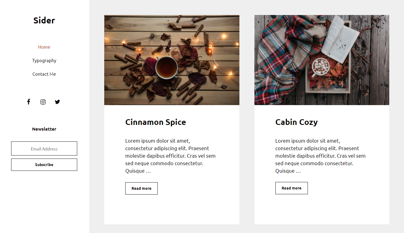
This example demonstrates how to create a sidebar-style header and can be seen in the Sider template in the site library.
First, create a new menu with the desired items and assign this menu to the Primary Menu under Display locations.
Then add other desired content in the header widgets area. The Sider template is using Lightweight Social Icons and MailChimp.
Lastly, add the required CSS to create the sidebar-style header:
@media (min-width: 1000px) {
    body {
	padding: 0 50px 50px;
	margin-left: 300px;
    }

    .site-header {
	position: fixed;
	left: 0;
	top: 0;
	width: 300px;
	z-index: 300;
	height: 100%;
	overflow: auto;
	overflow-x: hidden;
	-webkit-backface-visibility: hidden;
	-webkit-overflow-scrolling: touch;
	transition: .1s ease;
    }

    .admin-bar .site-header {
        top: 32px;
    }
    .site-header .main-navigation li {
	float: none;
    }
}
.inside-header {
    flex: 1;
    flex-direction: column;
}
.header-widget {
    order: 3;
    text-align: center;
}
.nav-float-right .inside-header .main-navigation {
    order: 2;
    margin-top: 50px;
    margin-bottom: 50px;
}

.dropdown-click .site-header .main-navigation ul ul {
    position: relative;
}

.main-navigation .main-nav>ul {
    flex-direction: column;
}

.nav-float-right .header-widget {
    margin-left: 0;
}

.nav-float-right .header-widget .widget {
    margin-bottom: 50px;
}

.nav-float-right #site-navigation {
    margin-right: auto;
}
Example 8

This example demonstrates how to float both the header widgets and primary navigation on the right of site logo.
The first step is to set the navigation location to float right in the customizer.
Then add in the desired header widgets. A search widget is used in the screenshot above.
Next, add the following PHP snippet:
add_action( 'wp', function() {
    remove_action( 'generate_after_header_content', 'generate_do_header_widget' );
    add_action( 'generate_before_navigation', 'generate_do_header_widget', 20 );
} );

add_action( 'generate_before_navigation', function() {
    echo '<div class="primary-navigation-wrapper">';
}, 15 );

add_action( 'generate_after_navigation', function() {
    echo '</div>';
} );
and then the CSS snippet:
.nav-float-right .primary-navigation-wrapper {
    margin-left: auto;
    text-align: right;
}

@media (max-width: 768px) {
    .primary-navigation-wrapper {
        flex-basis: 100%;
    }
}
Example 9

This example demonstrates how to float both the primary navigation and the secondary navigation right of the site logo.
Thanks to the new flexbox structure in GP 3.0, the layout should be the default when the primary navigation location and secondary navigation location are both set to float right.
You can also add the CSS below to separate the two navigations with some space:
@media (min-width: 769px) {
    .main-navigation {
        margin-bottom: 10px;
    }
}