By default, GeneratePress has a mobile navigation that kicks in at 768px. You can see it yourself by resizing your browser while viewing your website.
While everything works without you having to do anything, there’s some tricks that you might find useful.
Opening sub-menus
If your navigation has sub-menus, you might wonder how you can expand them on mobile.
By default, you can tap/click the dropdown arrow to the right of your menu item.
If you’d rather have the entire menu item area click/tap-able, you have two options.
Use “Click – Menu Item”
The first option is easy, simply change your dropdown type to Click – Menu Item. This makes it so your entire menu item can be clicked to open the dropdown menu.
The downside to this is it will change the functionality of your dropdown menus on desktop as well, and disables the parent item link.
Using # as your URL
This option allows you to use whichever dropdown type you like. You simply have to add your parent menu item as a Custom Link, and make the URL a hashtag: #
Of course, this makes it so the parent menu item doesn’t link anywhere, but will also make it so the entire menu item is click/tap-able on mobile while maintaining your dropdown type on desktop (hover etc..).
Initiating the mobile navigation at a different width
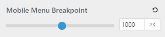
Changing the default 768px mobile menu breakpoint is super easy with GeneratePress.
Using GP Premium
If you have GP Premium, you can use the slider located under Customizer > Layout > Primary Navigation.
This will also apply to mobile header if you have the option activated.
Using a Filter
If you are using the free GeneratePress theme currently, you can use the generate_mobile_menu_media_query filter.