Note: This option requires the Menu Plus add-on in GP Premium.
The mobile header option is found in Appearance > Customize > Layout > Header.
This option disables the default website header on mobile devices:

and replaces it with a streamlined version:

The mobile header inherits your navigation colors set in Customize > Colors > Primary Navigation.
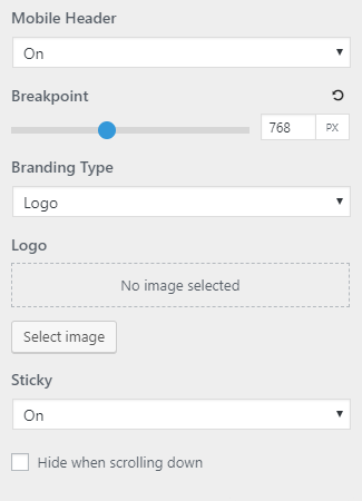
Breakpoint
Customize the px number when the mobile header kicks in. The default value is 768px.
Branding Type
Add the site title or a logo in the mobile header. It is recommended that the logo should be quite small – kind of like an icon for your website.
The height of the logo is determined by the menu item height option with mobile toggle activated.
If you want to adjust the logo size independently from the menu item height, then use this CSS :
.navigation-branding img,
.site-logo.mobile-header-logo img {
    height: 130px;
}
There are also 10px of default top and bottom padding which can be removed with this CSS:
.site-logo.mobile-header-logo img {
    padding: 0;
}
Sticky
Activate sticky mode for the mobile header.
Hide when scrolling down
Checking this option will hide the sticky mobile header unless you’re scrolling up towards the top of the site. This can save you valuable screen space.
Adding HTML Inside the Mobile Header
You may want to add more elements inside your mobile header like social icons, a phone number etc..
You can do so using the inside_mobile_header in the Hooks Element module.