In some cases, you may want to use a different menu on mobile than you use on desktop.
To do this, we’ll need to activate our Mobile Header feature.
Once you’ve turned on the Mobile Header, we need to create a new menu location. We can do that with this function:
add_action( 'init', function() {
    register_nav_menu( 'mobile-menu', __( 'Mobile Menu' ) );
} );
Then we have to tell the Mobile Header to use this new menu location with a filter:
add_filter( 'generate_mobile_header_theme_location', function() {
    return 'mobile-menu';
} );
These functions can be added using one of the methods explained here.
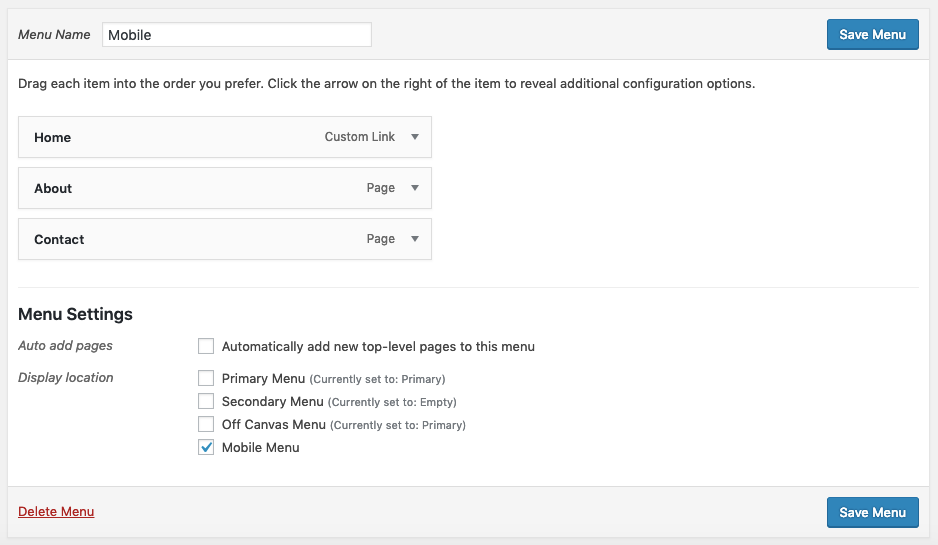
Now we can go into Appearance > Menus and create a new menu for our mobile site.
Once you’ve created your menu, you can apply it to the new Mobile Menu menu location.