Note: This option requires the Spacing add-on in GP Premium.
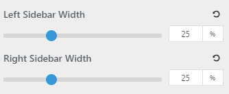
You can adjust the width of your sidebars in Customize > Layout > Sidebars.
The widths are percentage based, and the width of the content area is determined by the width of the sidebars.
Fixed Width
If you prefer to use a fixed width sidebar on desktop, try using the following CSS:
@media (min-width: 769px) {
    #right-sidebar {
        width: 300px;
    }
    .inside-right-sidebar {
        padding-right: 20px;
    }
    body:not(.no-sidebar) #primary {
        width: calc(100% - 300px);
    }
}
Using a filter
In some cases you might want to set the width of your sidebar(s) differently than the global setting.
For this, we can use some PHP. For example, the right sidebar:
add_filter( 'generate_right_sidebar_width','tu_custom_right_sidebar_width' );
function tu_custom_right_sidebar_width( $width ) {
        // If we're on the home page
	if ( is_front_page() ) {
		return 40;
	}

        // Return the default
	return $width;
}
add_filter( 'generate_left_sidebar_width','tu_custom_left_sidebar_width' );
function tu_custom_left_sidebar_width( $width ) {
        // If we're on a category
	if ( category() ) {
		return 40;
	}

        // Return the default
	return $width;
}
Learn how to add PHP here.
When setting your custom value, set it as an integer while remember it represents a percentage. The above example is assuming we want a 40% wide sidebar.
You can use any of the available WordPress conditionals.